Throwback to a recently discovered History of Graphic Design paper and “Modernism” creative response I wrote and created in college.
I chose the surrealism art movement; it influenced my poster design because I had designed a previous piece for my final English project where we had to choose a written work and translate it into a creative response. I knew I wanted to revisit that type of design style and asked my History teacher which art movement would it best represent. She decided on surrealism. While I was researching, I remembered I had seen Little Ashes, the 2008 movie about a surrealist poet, Federico García Lorca and a surrealist artist, Salvador Dalí going to art school together. I used Dalí’s works as reference and added inspiration to my own interpretation of Lorca’s poem.
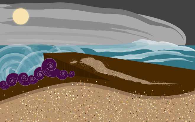
I used various brush strokes from the brush library in Adobe Illustrator to symbolize the spiraling, out of control, natural disaster at the pier leading to nowhere. I used basic shapes and textures so it could be interpreted the same or differently by viewers, however still maintain my initial concept. Creating a landscape was key; Lorca’s “Landscape of a Vomiting Multitude” poem described an amazing setting. I wrote down keywords that I could use: Octopus, pier/boardwalk, sand, moon, and clouds. I did research and found out some analytical meanings of the poem. The vomiting reference could mean consumerism. I’m afraid of heights and whenever I’m on a bridge, pier, or near water; I wonder about underwater consuming creatures like the kraken, loch nest monster, and giant squids. I know it’s silly to fear such things, but in a “super reality…” Anything is possible!
I think the color scheme works well; earth tones for the sand and pier, grayscale clouds, muted shades of blue in the water, and the brightest color is purple for the octopus. I would change the shades of brown on the pier to distinguish the perspective and layers so it doesn’t look like a big block of brown.
